Dutch Country Gift Baskets

Client:

Dutch Country Gift Baskets & Cheese

Services:

Logo Design, Photography, Print Ad Design

Timeline:

April 1, 2025

Meet the Client

Dutch Country Gift Baskets and Dutch Country Cheese are two sides of the same family-owned company based in Lancaster County.

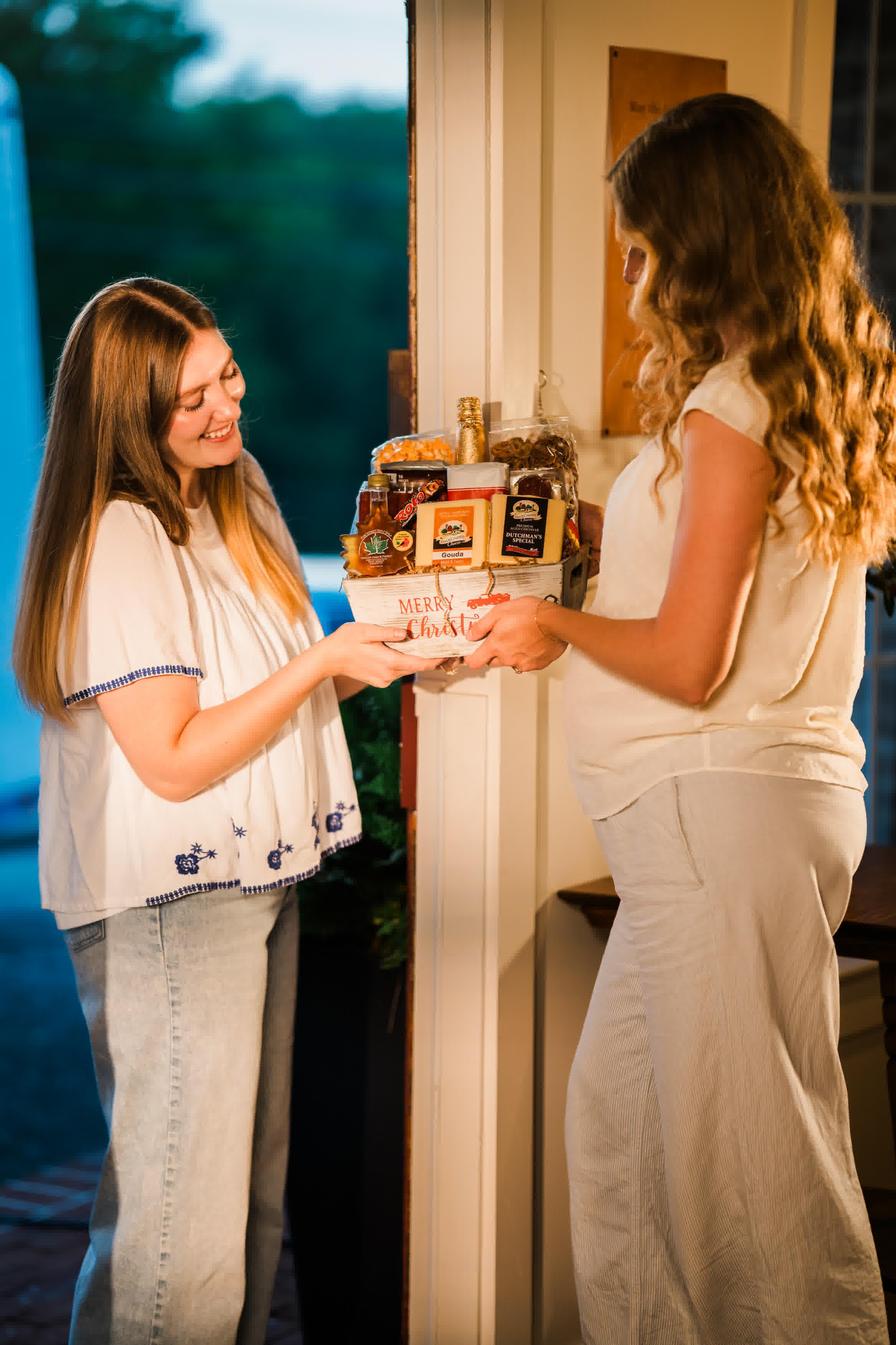
One crafts high-quality cheese; the other builds thoughtful gift baskets that bring people together through generosity and care. Their products are handmade, rooted in tradition, and carry the quiet excellence that defines Amish craftsmanship.

Challenges

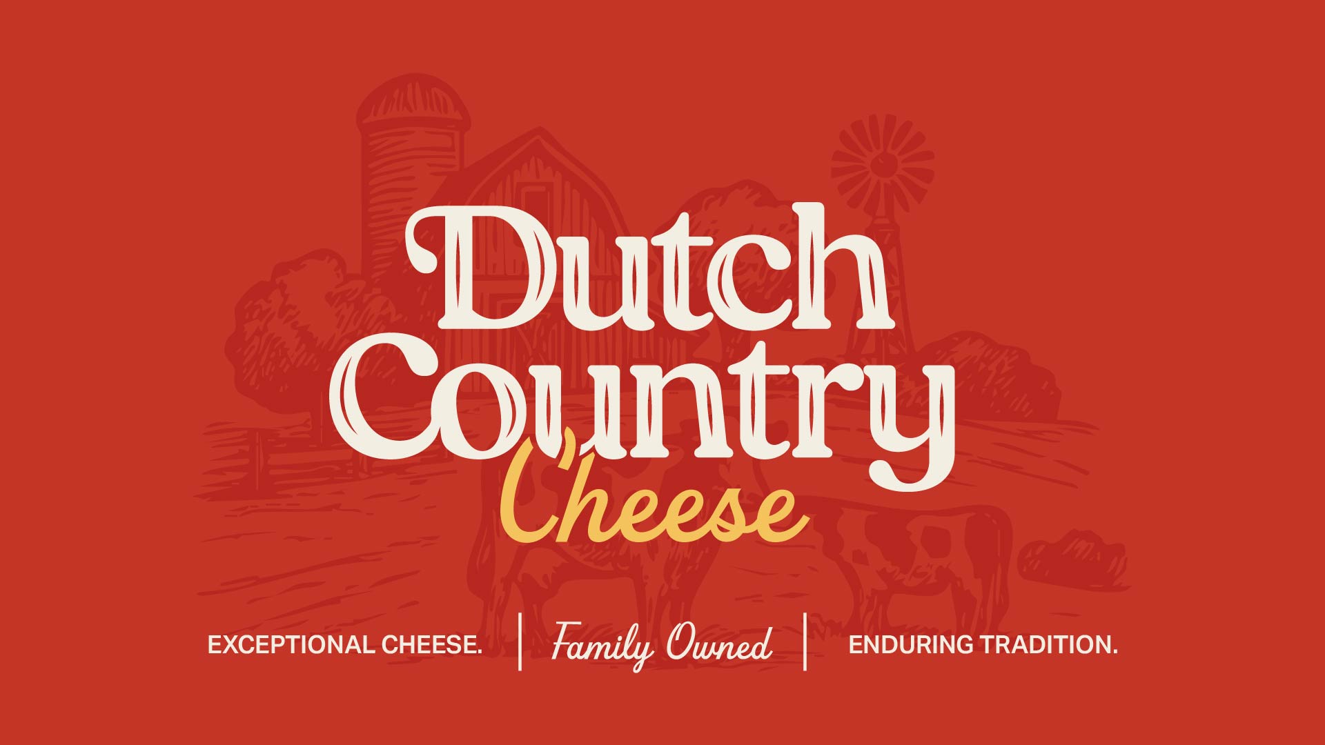
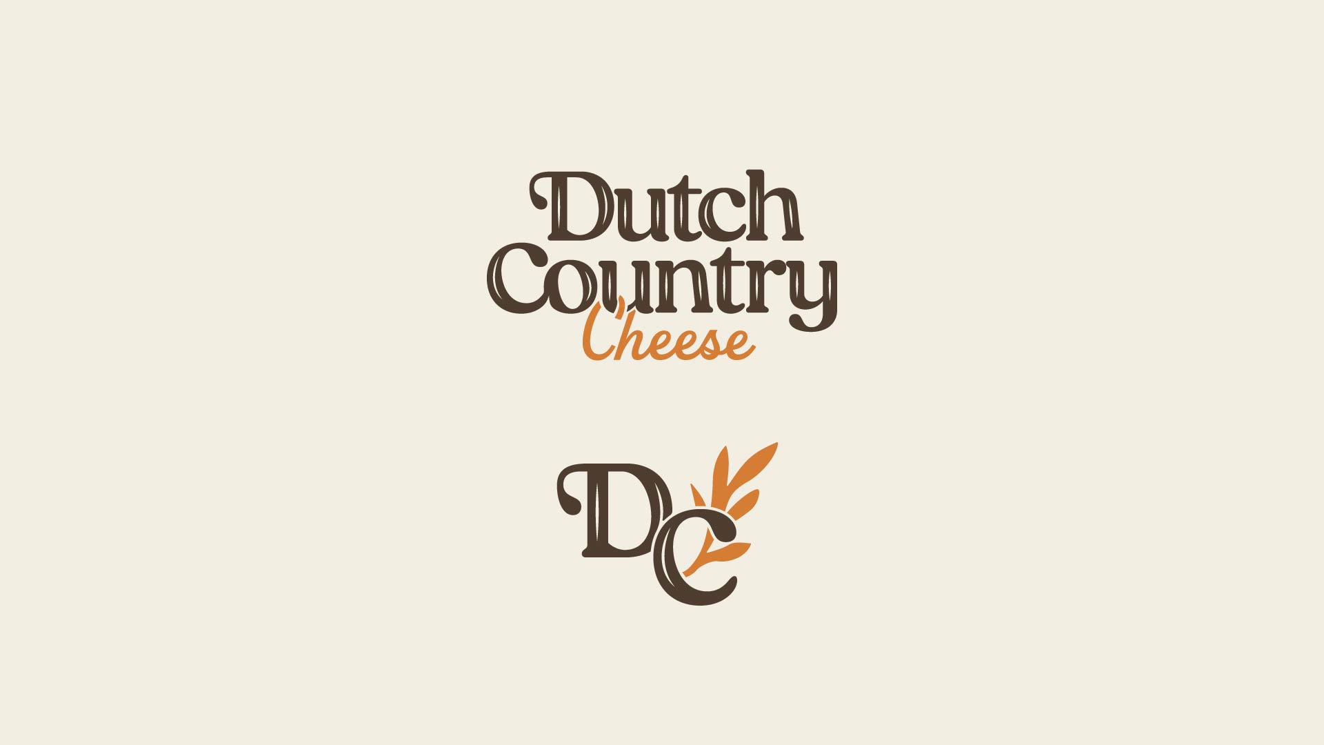
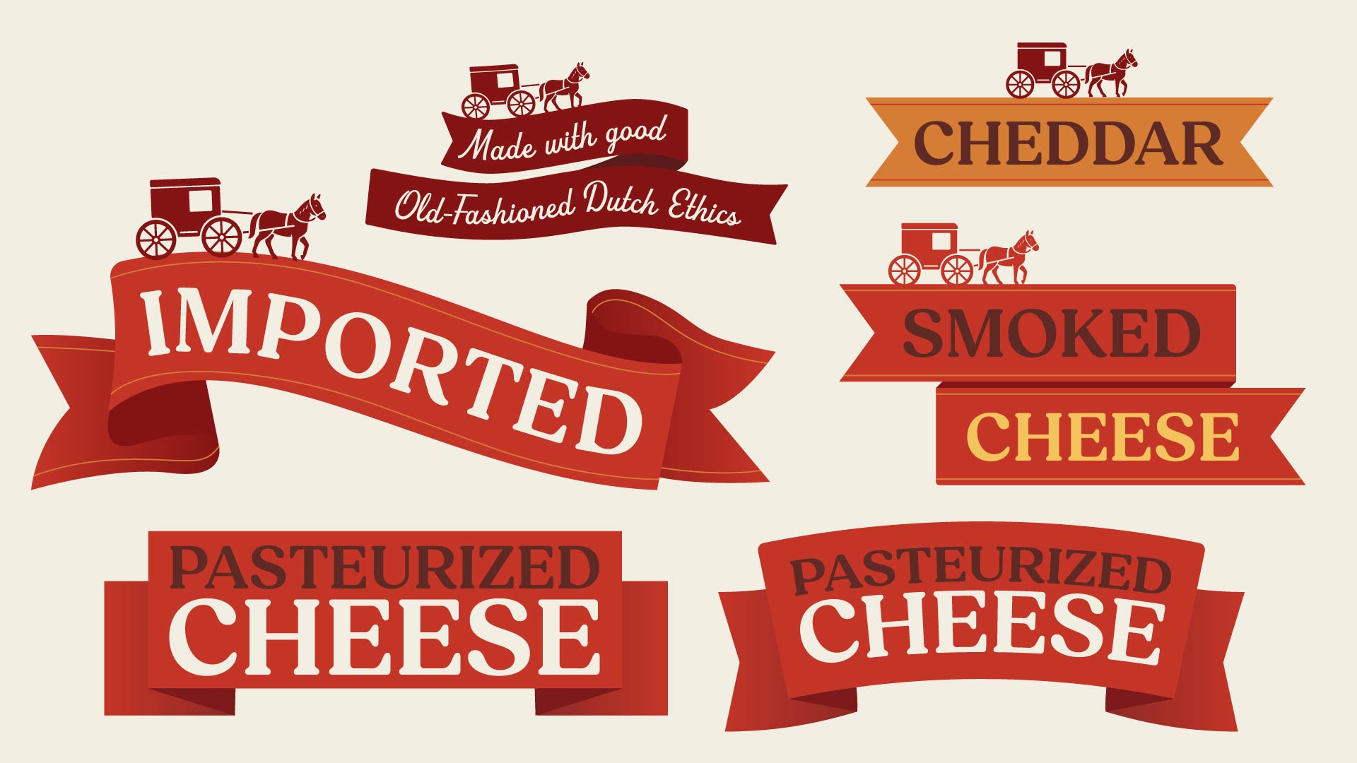
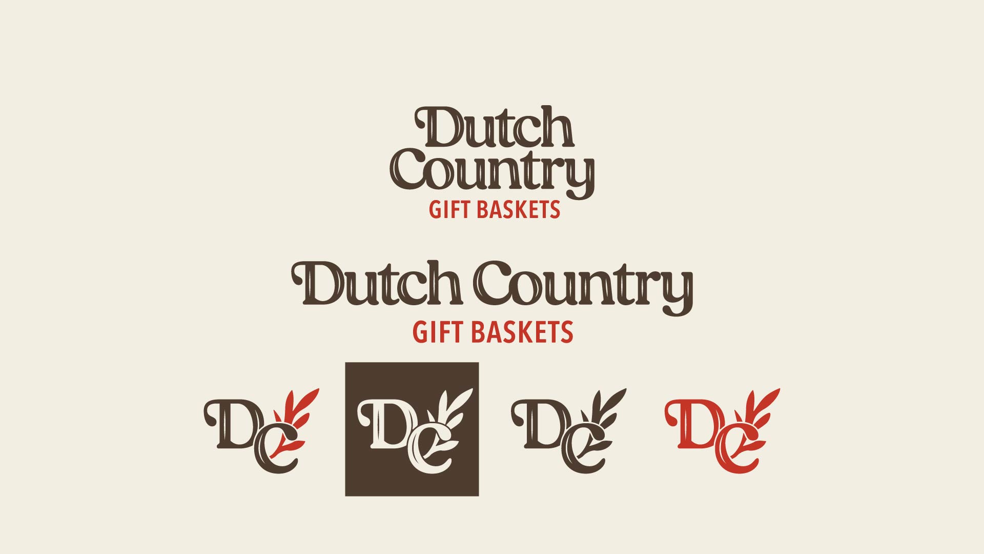
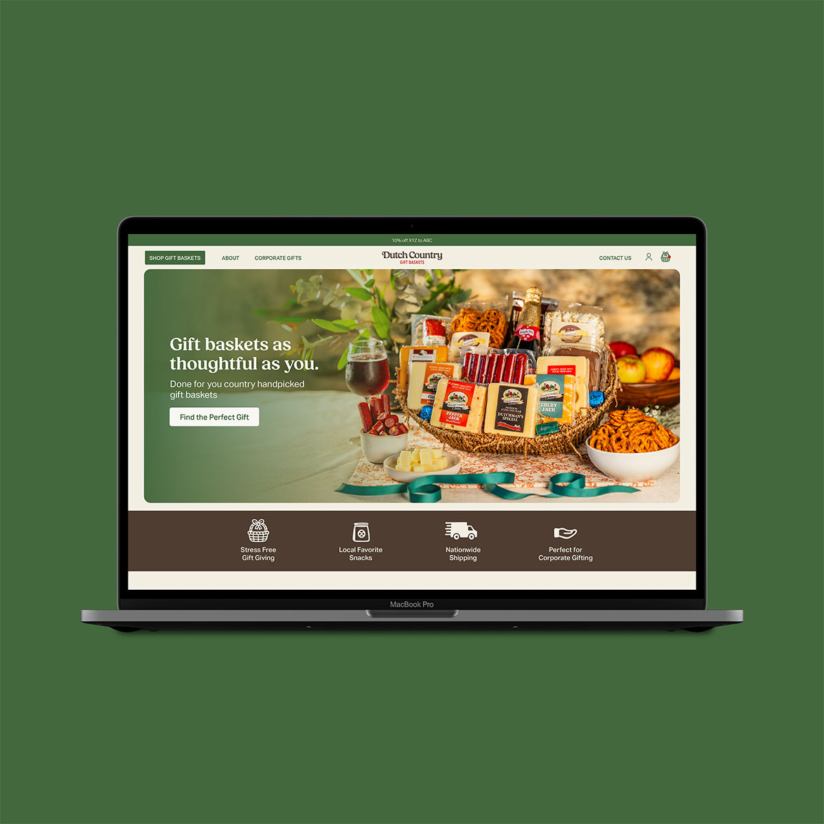
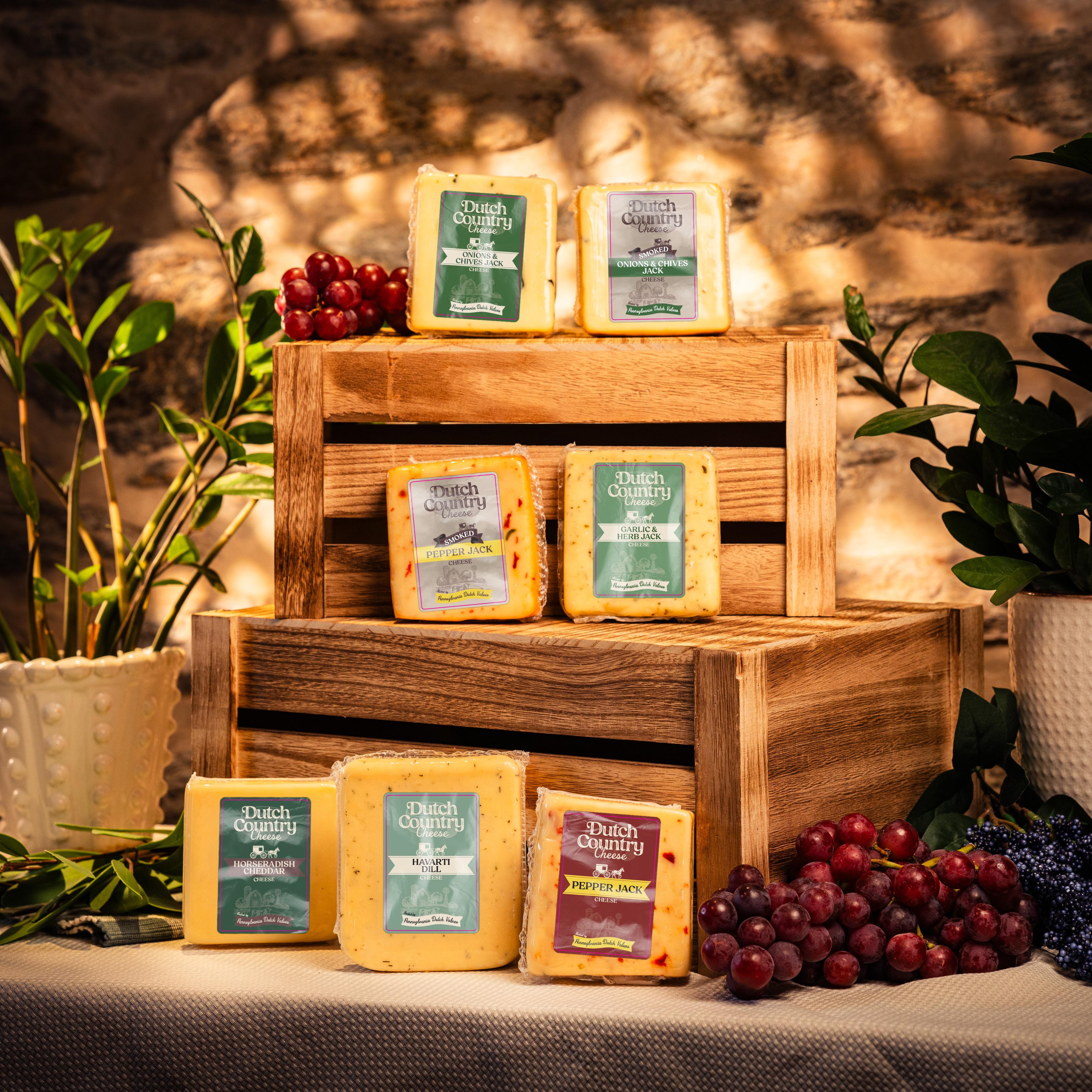
The brand’s visuals no longer reflected the quality of the products or the heart behind them. Their logo wasn’t a true, versatile mark—it lacked clarity and didn’t translate well across packaging or digital use.

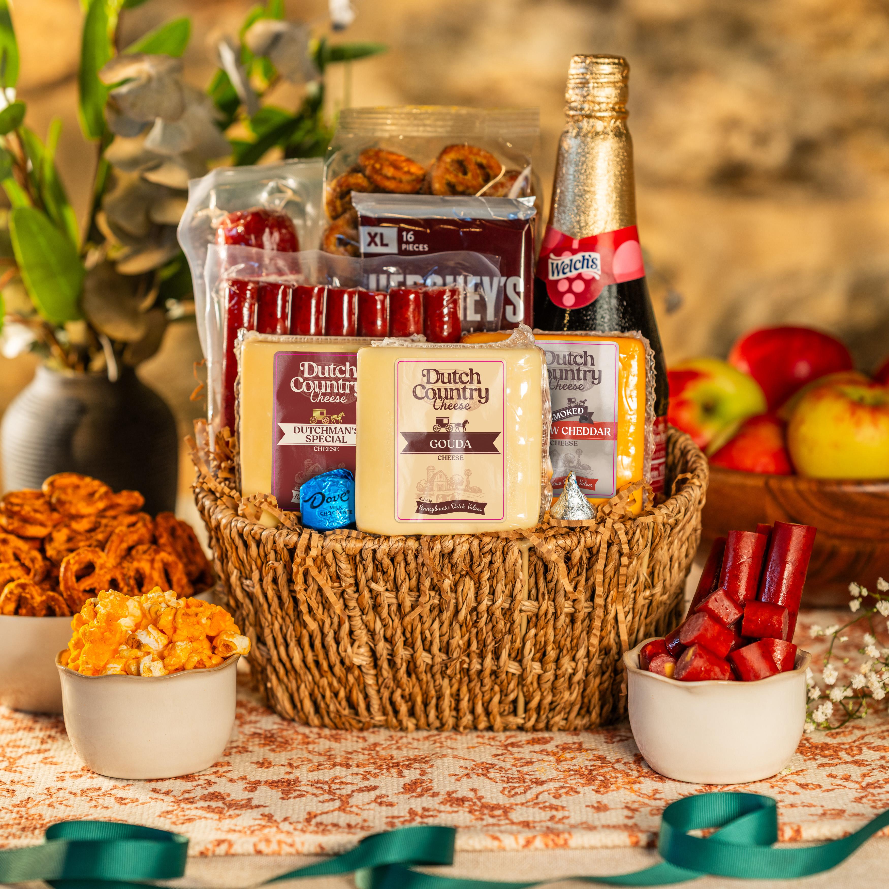
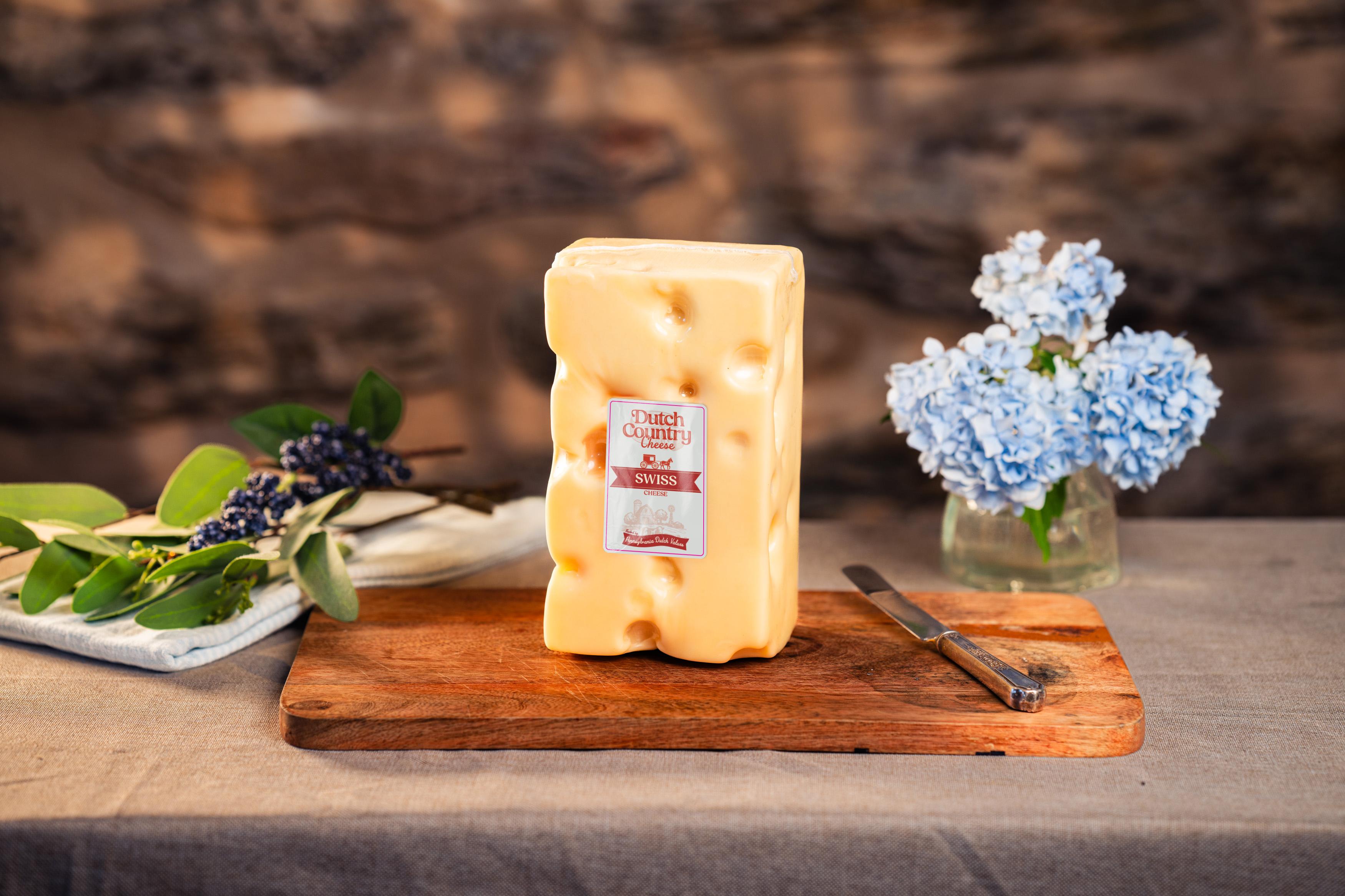
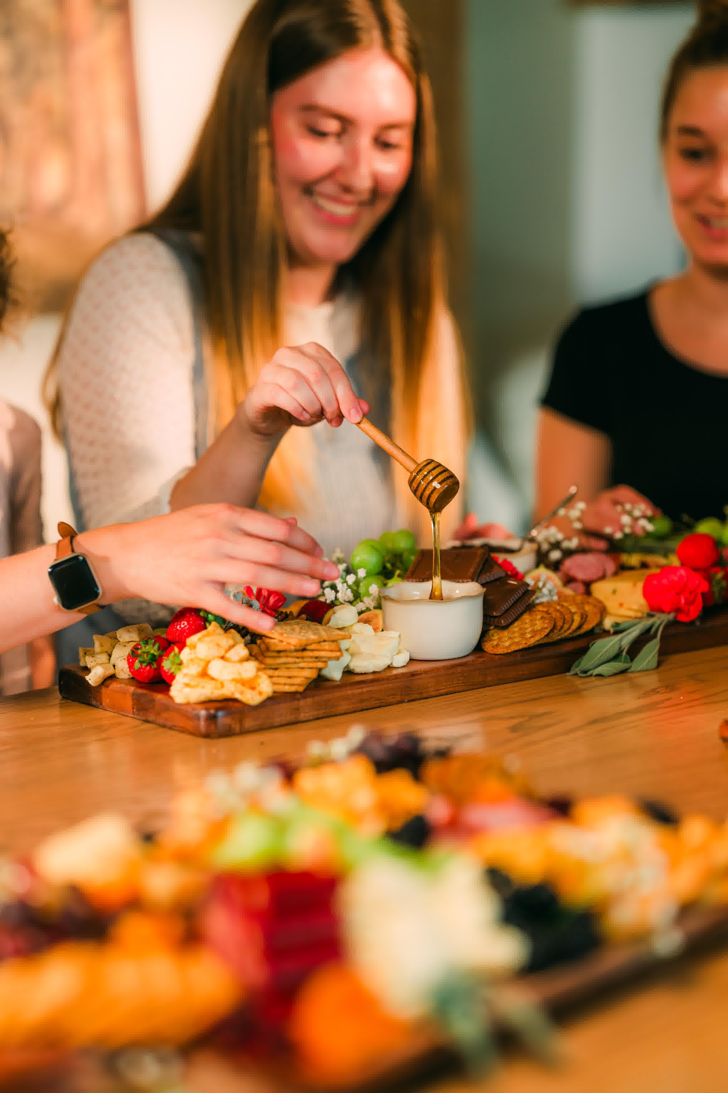
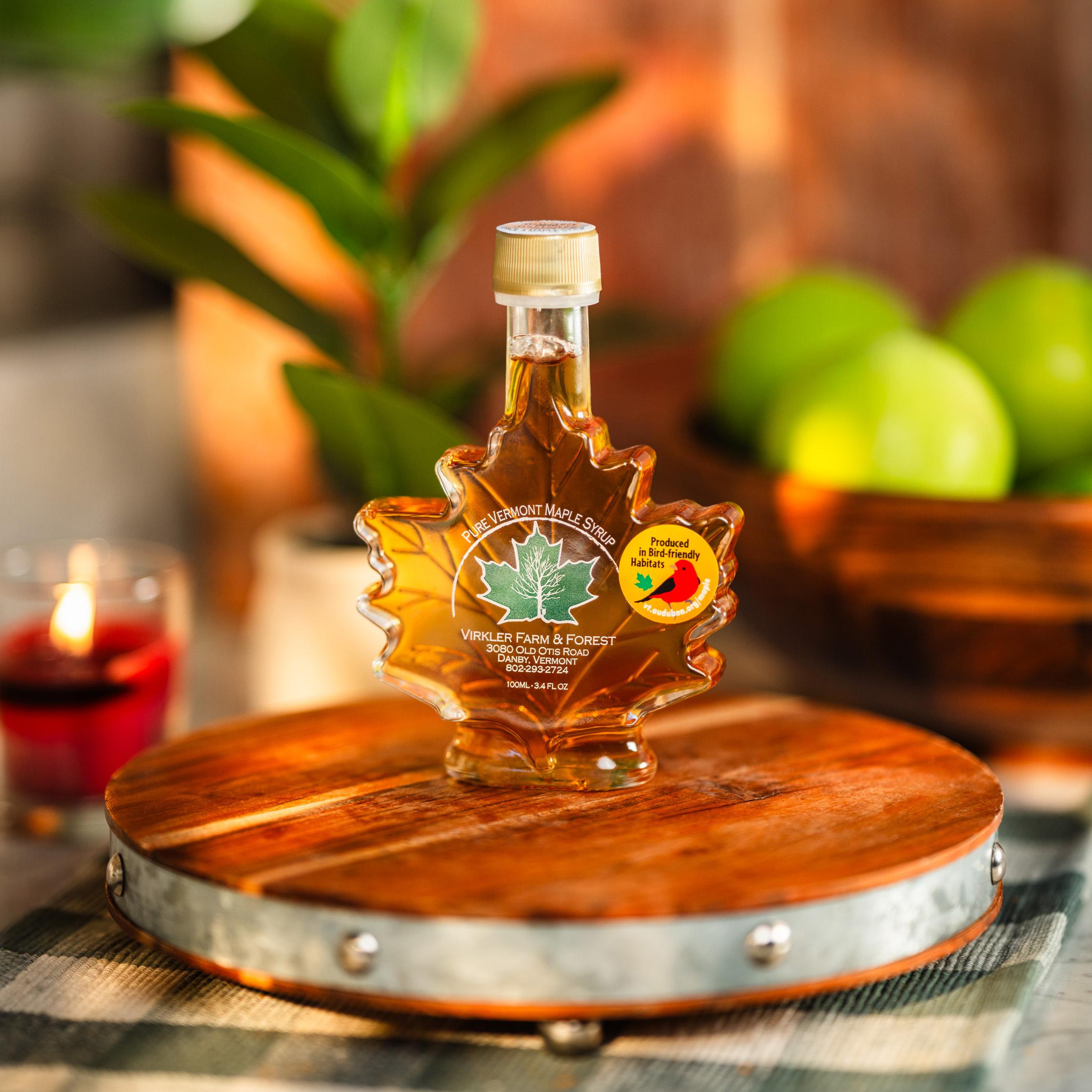
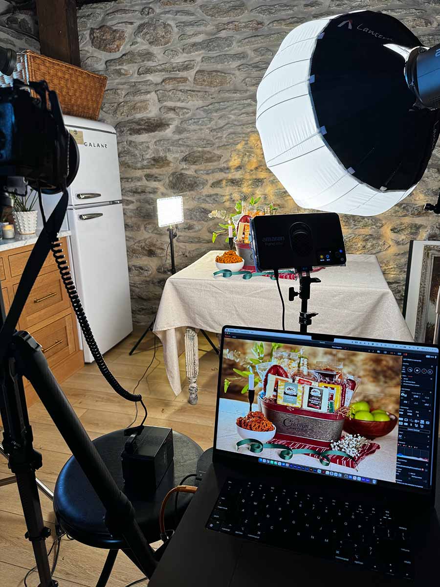
They also needed fresh, cohesive photography that better captured the texture, warmth, and story behind their products.

At its core, the challenge was to honor their roots while updating their image—to create a modern system that felt timeless and true.

Our Process

We began with a two-hour discovery session to learn about the company’s history, mission, and values.

We talked through what makes them unique, their audience, and even addressed a few business challenges during that first meeting.

The project started with a full visual identity redesign—creating multiple logo concepts that balanced heritage and modern usability. From there, the work naturally expanded into photography, catalog design, print ads, and web updates, ensuring every visual touchpoint felt consistent.

Brand Story & Messaging

Both brands went through a complete StoryBrand process.

We clarified who their customers are, what problem they solve, and how their products create meaningful experiences.

For Dutch Country Cheese, the focus was on craftsmanship and purity—simple ingredients made with care.

For Dutch Country Gift Baskets, the message centered on connection and generosity—giving gifts that mean something.

This messaging now anchors their web copy, product descriptions, and print materials.

Logo & Design

The original logo lacked flexibility and impact. I redesigned it into a complete identity system, including primary and secondary marks, refined typography, and a color palette that feels natural and timeless.

It honors their heritage but finally gives them a logo they can use everywhere—from labels and boxes to signage and social media.

The new identity system set the tone for every other deliverable.

It’s approachable yet confident, built to last—much like their products.

No items found.

Photography

This project involved two distinct types of photography:

Product Photography – Focused on precision, texture, and lighting. Each cheese and basket was styled and shot with care to bring out the natural color and detail. Because labels weren’t yet finalized, I digitally applied each design in post-production, ensuring every photo looked finished and usable across marketing materials.

Lifestyle Photography – Centered on warmth, hospitality, and storytelling. I directed scenes with real people enjoying the products, capturing that sense of community and generosity Dutch Country stands for. These shots now drive their catalog covers, website imagery, and print ads.

Together, the product and lifestyle photos tell a complete story—quality and connection in perfect balance.

Print & Web

Once the new identity and photos were complete, I designed a series of print ads and catalog layouts that better reflected the brand’s story. Each layout leads with a clear message, strong visuals, and a simple call to action.

We also redesigned core website pages for both brands using the StoryBrand structure—helping visitors immediately understand who they are, what they offer, and why it matters.

This project was a full refresh from top to bottom—new identity, new visuals, and a clearer message that finally matches the quality of Dutch Country’s products. Seeing the new photos and branding already in use this season is the best part.

This project was about breathing new life into a brand that already had deep roots.

From the updated logo to the photography and catalogs, every piece was designed to carry forward the same heart of generosity and quality that defines Dutch Country.

Merv and his team have already begun using the new photography and materials as they head into their busy season, and the results are looking great.

LETS chat

The Best Time to Strengthen Your Brand Is Now

Get a clear plan to elevate your visuals and equip your sales & marketing teams with assets that actually move the needle.