
Firn
Brand strategy, identity, packaging, and web for a GLP-1 fiber bar
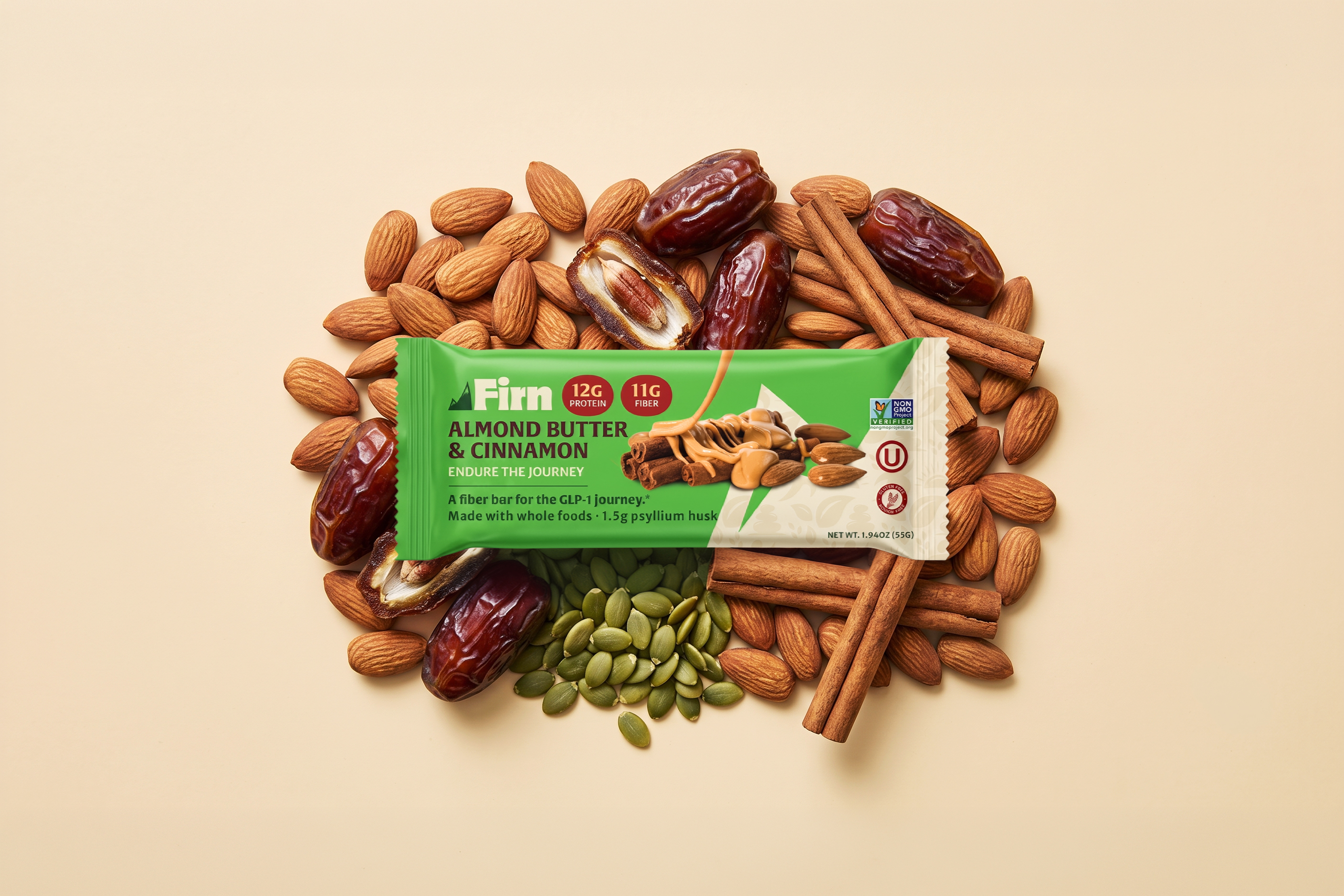
Firn is not currently in market. This case study is published with the client's permission.
Melvin Lapp called me in the spring of 2026 to build a brand from nothing. Six months later we had a brand foundation, a visual identity, finished packaging artwork, and a nine-page website ready to hand to a developer.
The bar is not on a shelf anywhere. I'll get to that at the end.
A friend of Melvin's, a doctorate-level botanical medicine expert, started a GLP-1 and lost forty pounds in a few months. The medication was working and the journey wasn't. He went to the bar aisle one afternoon looking for something he could eat that wouldn't make him feel worse. Maltitol, whey isolate, sucralose. Every bar on the shelf was full of the exact things his body was rejecting. He went home with nothing, then called Melvin and said someone needed to make a bar for this.
Melvin grew up Amish in Lancaster County, descended from Anabaptists who fled Canton Bern in the 1700s. He took the call seriously.
That's a good origin story. It isn't a strategy. So we started with the person buying it.
We built her out as Sarah. Fifty-two, Cincinnati, HR director, seven months into Wegovy, thirty-one pounds down with twenty-five to go. Injection day Thursday evening so the nausea hits while she's asleep. She tried RXBars and found them too dry to chew when she felt sick. She quit Quest after three because the maltitol made things worse.
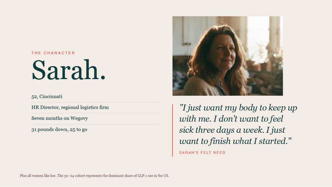
Her problem ran three levels deep, and most brands in this category only speak to the first. Externally, the side effects. Internally, the fear she'll quit and lose everything she's built. Philosophically, that a woman working this hard shouldn't have to choose between her health goals and feeling like a normal person. That third level became the moat, because no multinational entering this space can credibly speak to it.
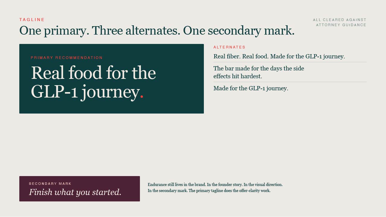
The tagline is where I had to walk something back. Melvin had drafted "Built to endure" before I came on, and he liked it. It's a nice phrase that doesn't name the category or the felt need. We landed on Real food for the GLP-1 journey, with Finish what you started as a secondary mark carrying the emotional weight. Endurance didn't disappear. It moved to where it belonged.
Then we stopped guessing. I interviewed eight people on GLP-1 medications through Respondent.io. I opened every one the same way: you cannot offend me, I'm doing this on behalf of someone else, be as brutally honest as you're willing to be. That framing did more for the research than any question I asked. It let me listen as someone trying to learn instead of someone defending work. They were the best part of the project.
Five things came back that changed the brand:
- Everyone reads protein first. Eight out of eight, before fiber, before brand. Our story led with fiber, which was strategically right and regulatorily required. But protein is the entry ticket on a shelf.
- The GLP-1 line was the hook. Instantly understood, including by the woman with ulcerative colitis who can't eat the bar and still called the idea great.
- Nobody could read the name. Five of eight saw "Firm." Several read the mountain as generic outdoors. One said REI. One said Cliff.
- Green beat orange. Malaika gave the reason that actually mattered: orange disappears against everything else on the shelf.
- Lisa would hide it. She'd buy the bar because it says GLP-1, then hide it from people who didn't know she was on the medication, the same way she hides her shot. The thing that sells it is the thing that makes her tuck it in a drawer.
Hold onto that last one.
My process is the same every time. Foundation first, then a mood board, then several distinct directions rather than variations on one idea. Melvin and I went through a wall of packaging, logos and shelf photography I'd pulled from Whole Foods, Target and everywhere else, and narrowed to what he responded to. Bloom kept coming up. Bold, playful, unmistakably aimed at women.
I brought four directions.
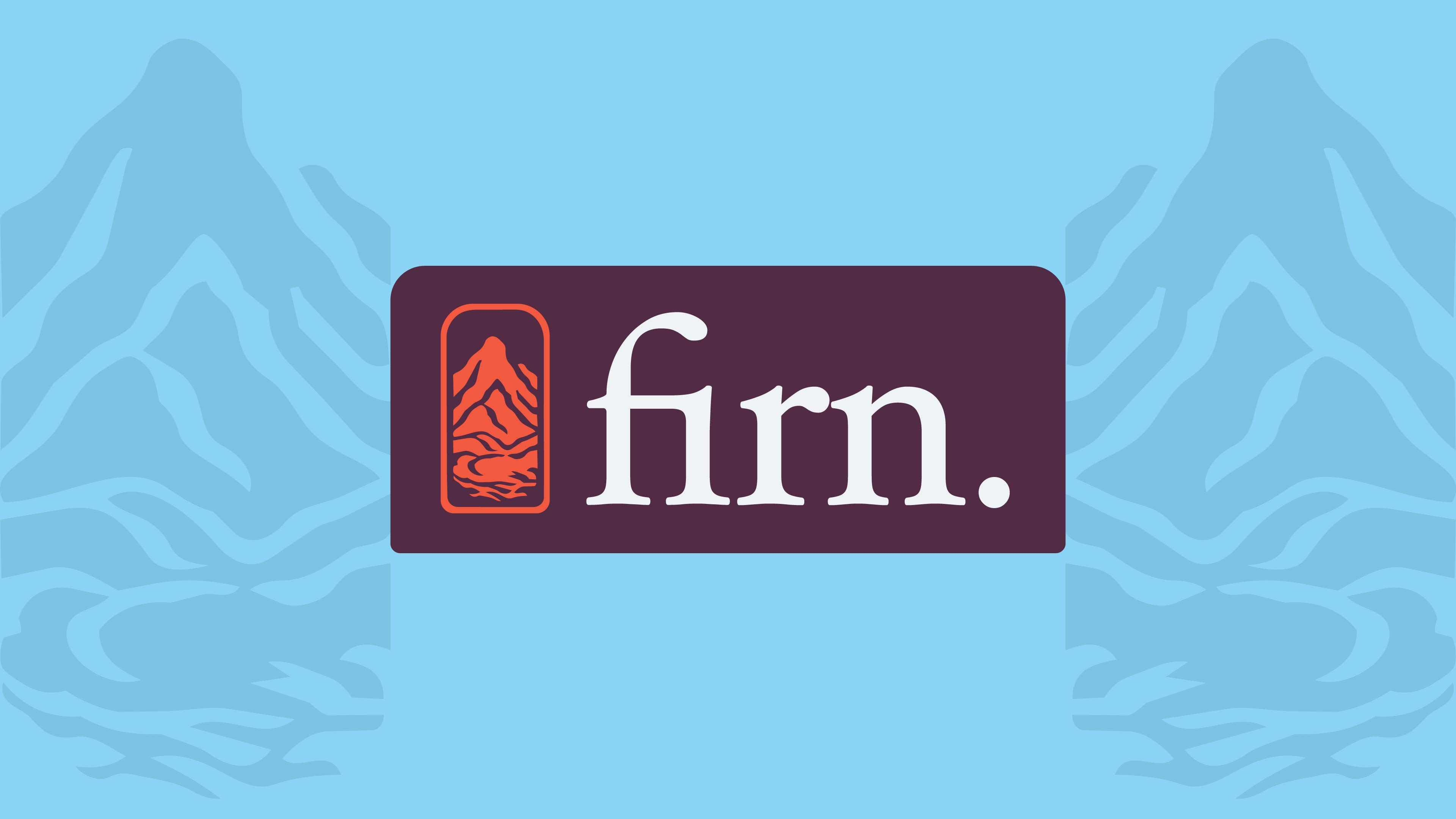
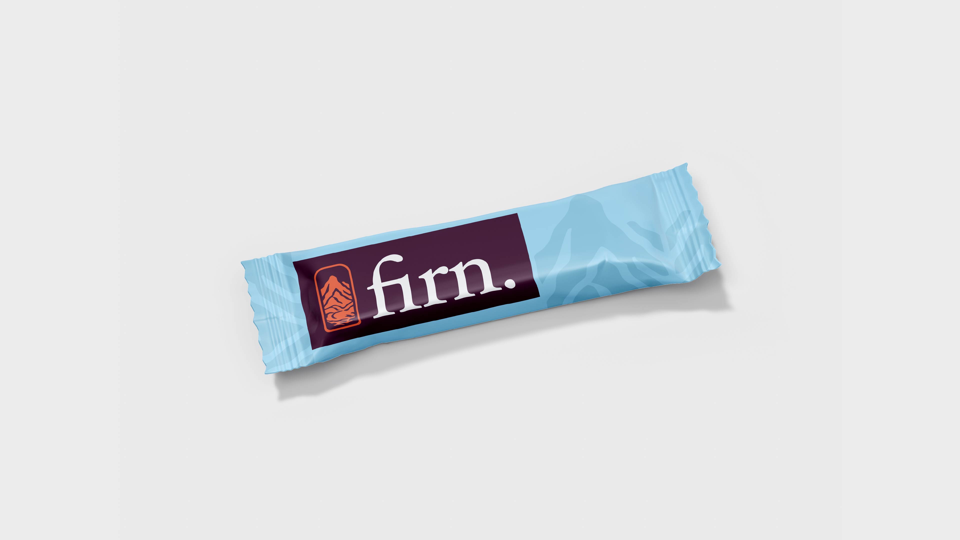
The first was a refined serif wordmark with a mountain-and-reflection illustration, cool toned, a little aged. Privately I thought of it as the safe one. I liked the font, I had the psychology worked out, and it was good enough.
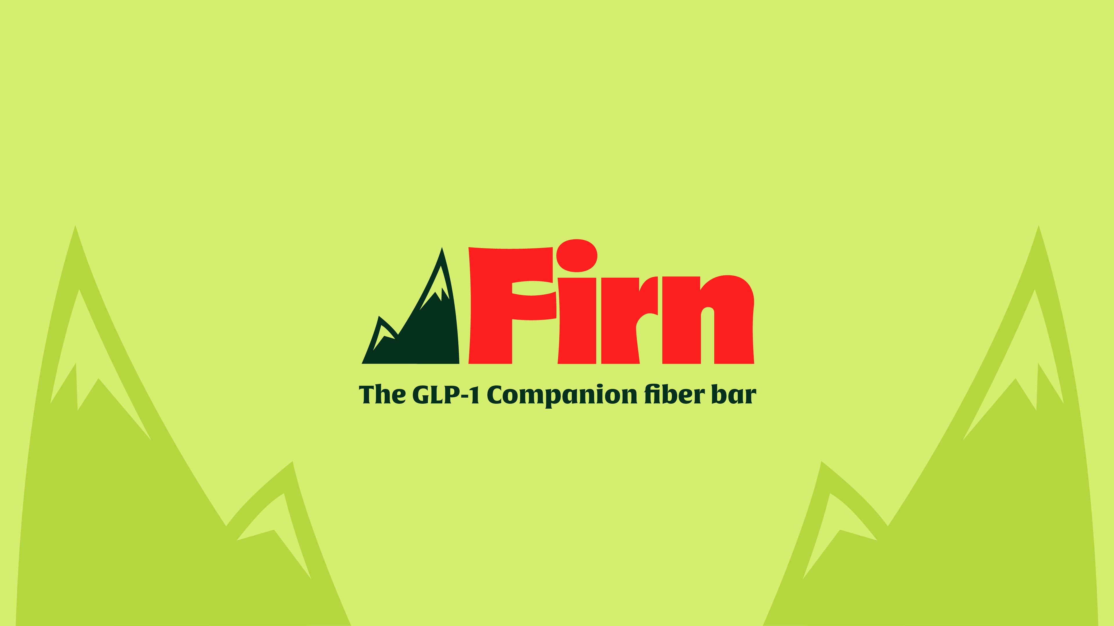
The second was a departure. A bold capital F, mountain peaks cut into the letterform, softened with curves so the weight read as friendly instead of aggressive. I made it after the safe one, mostly to see what would happen.
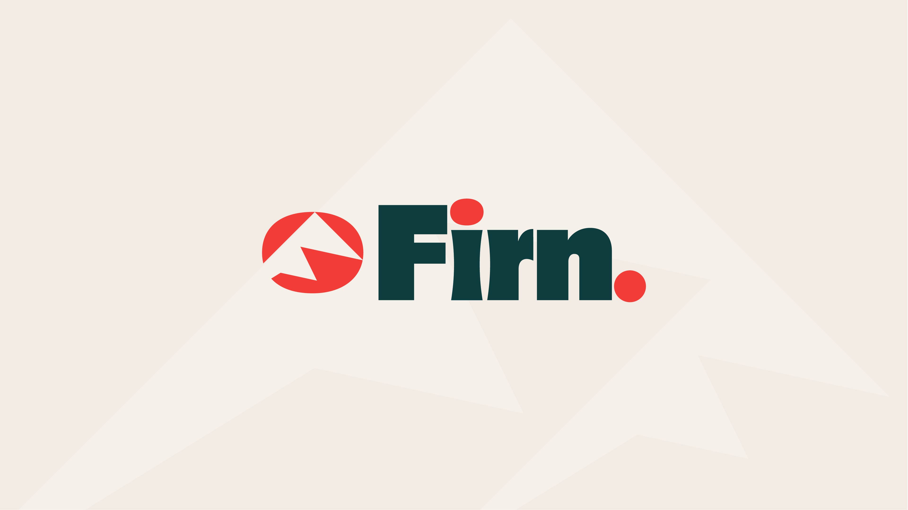
The third pushed the F further into abstraction. The fourth went the other way entirely, chiseled and etched, closer to RXBAR.
Melvin picked the second one within about a minute of seeing it. He liked the capital F, the boldness, and the way the peaks read as striving toward something. Later in the call he said it was both inspirational and aspirational, and connected it back to Bloom himself.
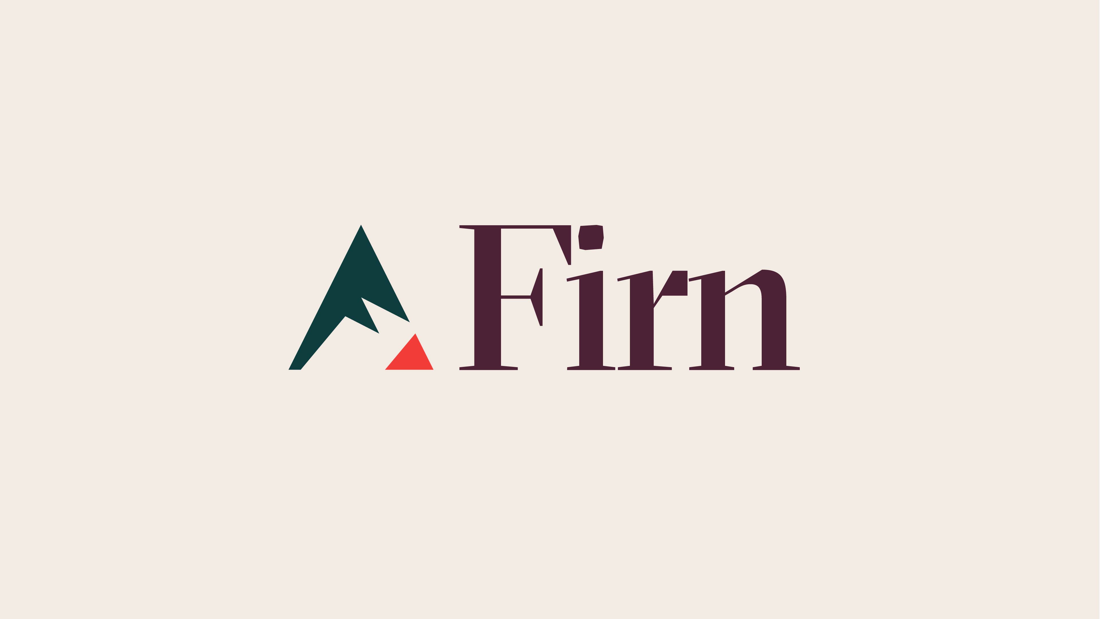
He called the fourth too boxy and the third confusing, and told me the slender letterform idea in the third was worth pulling forward. So it went into the refinements.
The safe concept lost. That's usually how it goes.
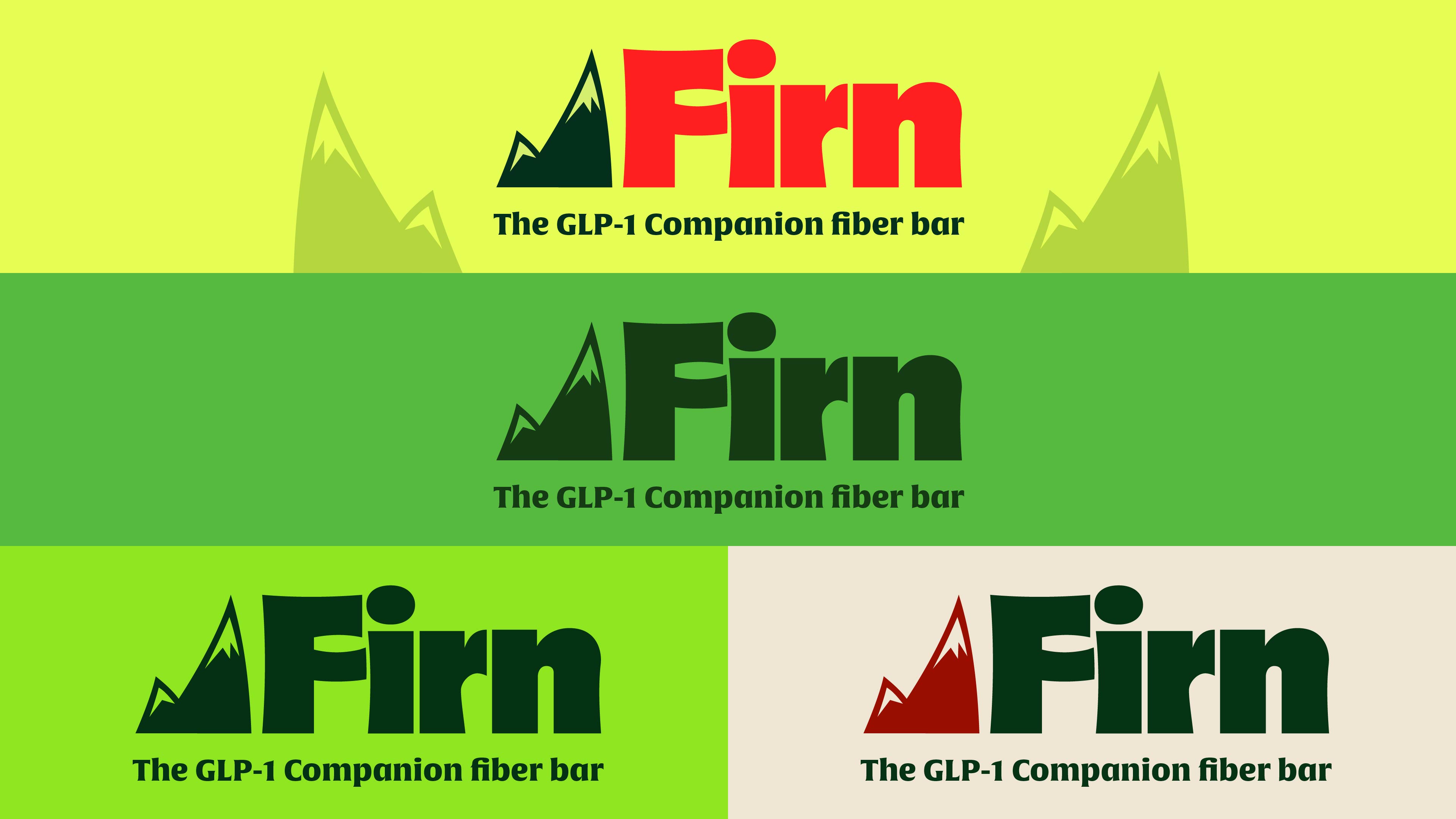
From there, iterations. The period came off the wordmark. A version with playful serifs. Multiple palettes side by side so he could react to color separately from form.
The palette is the part I'd argue was most useful to get wrong first. My Phase One deck used deep teal, coral, soft pink, mint and burgundy. Cool, wintry, glacial, and defensible given the name means compacted snow. Melvin's response was that he wasn't sure about the red, followed immediately by the thing he said in nearly every call: he isn't the target demographic. He pushed warm, and toward a deeper maroon. Then the customer interviews settled it. Green won outright, and orange lost because it disappeared on a shelf.
So the palette moved from a designer's instinct to a client's read on the category to actual evidence. Green ended up the hero color on a tan ground, with maroon, red, almond and cream doing accent work.
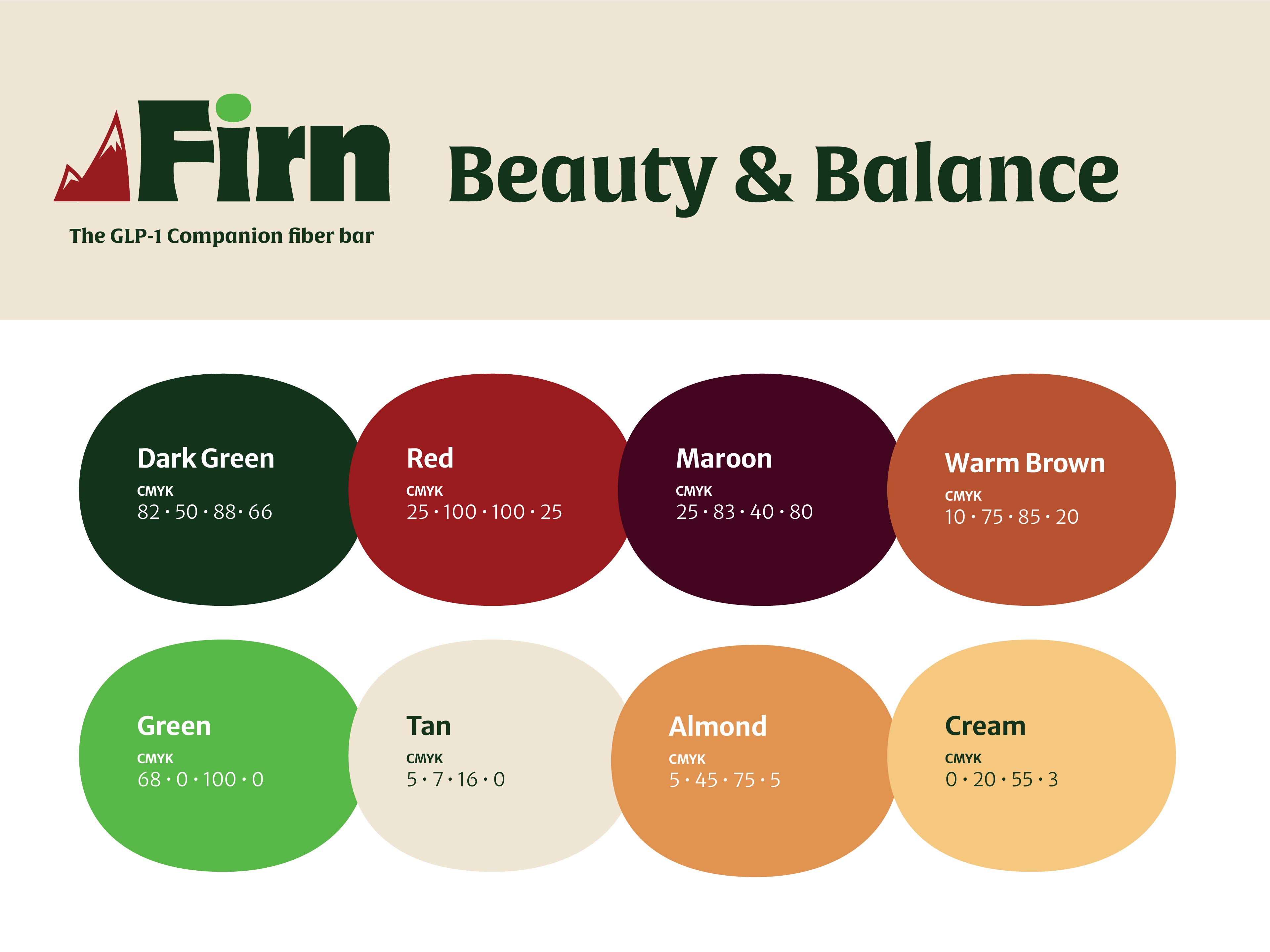
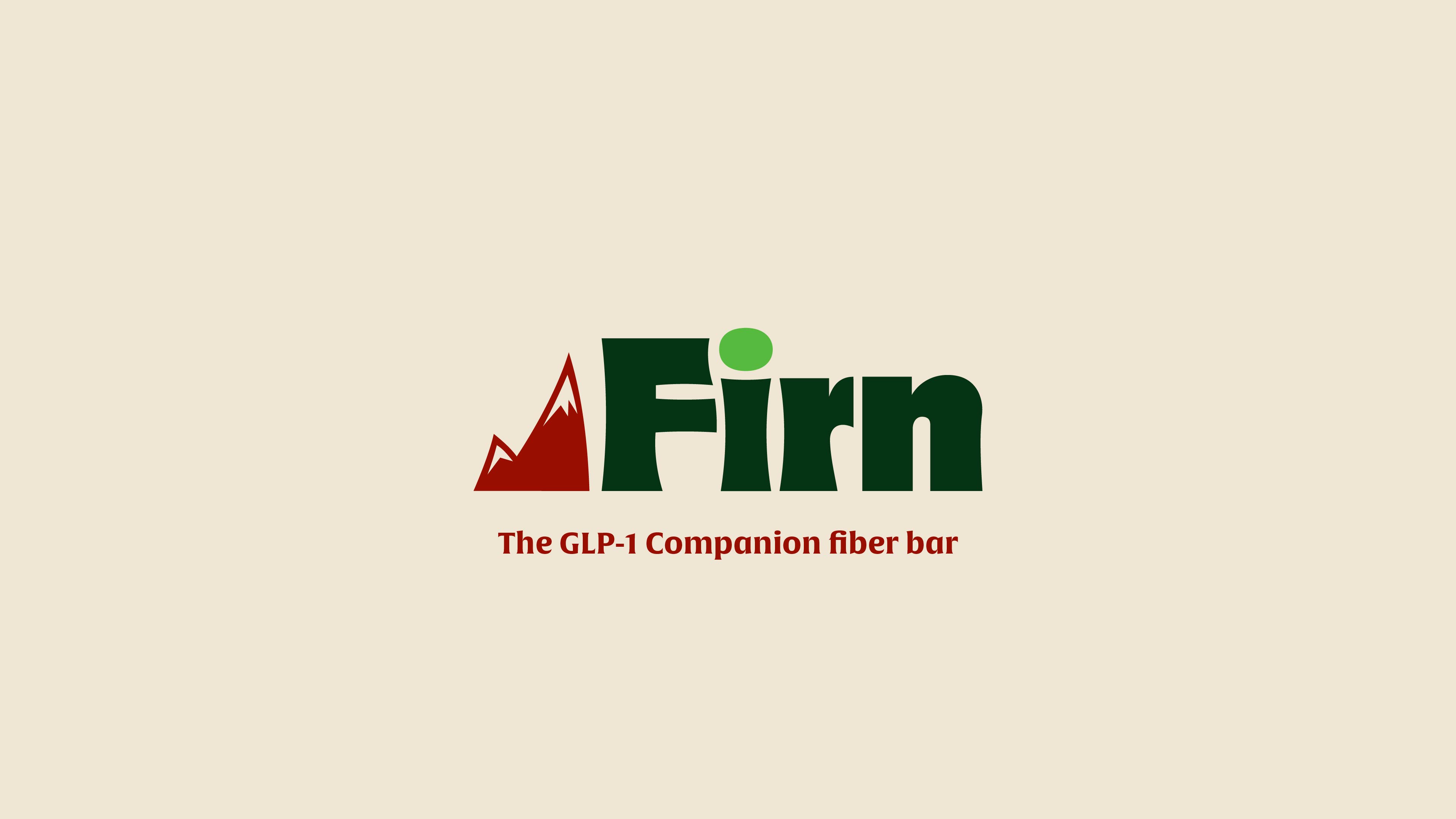
The final system: Alverata Informal as the display face with Merriweather and Merriweather Sans underneath, eight colors, a mountain logomark, four favicon treatments, eight illustration marks and a set of patterns built off them.
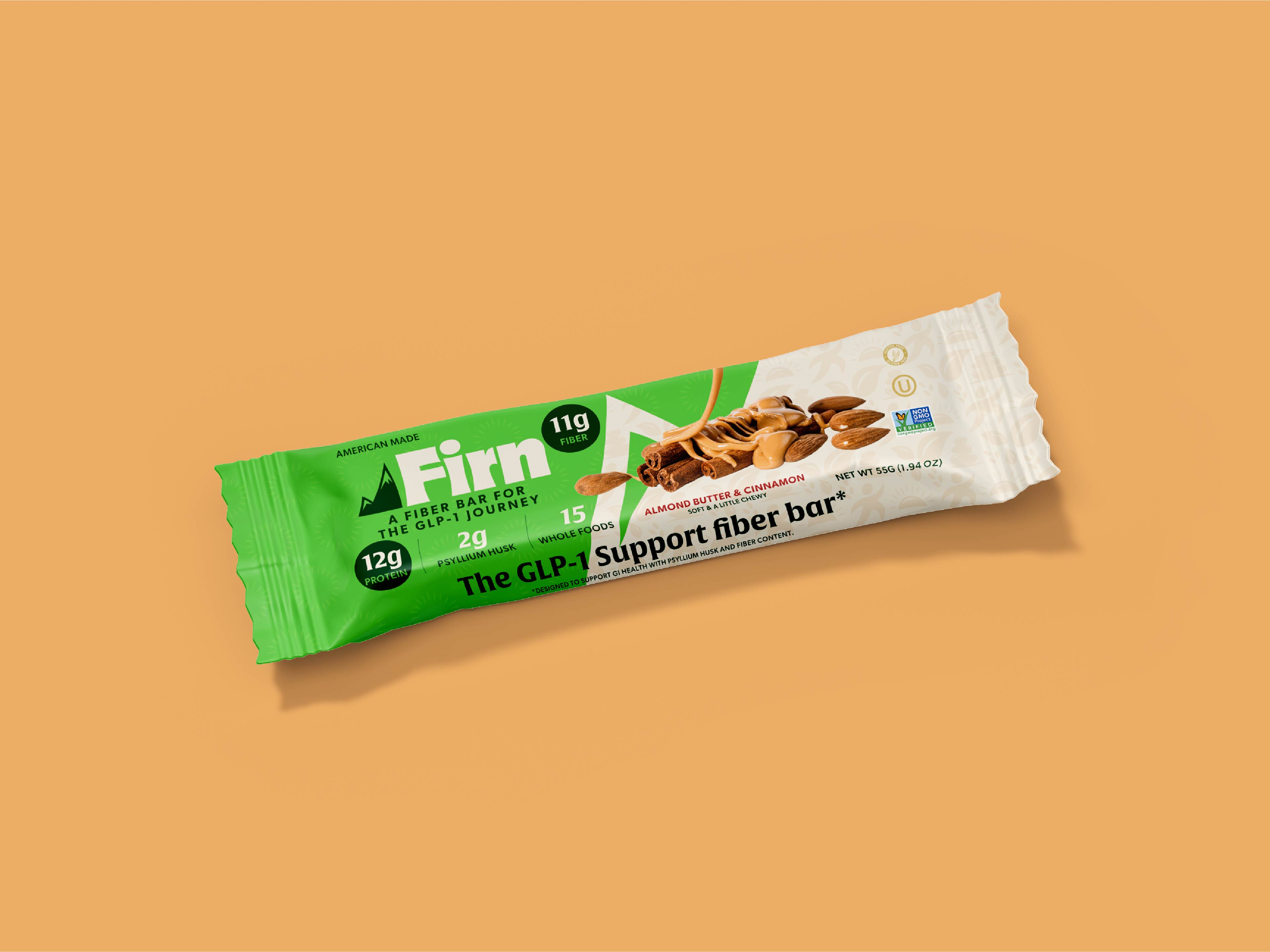
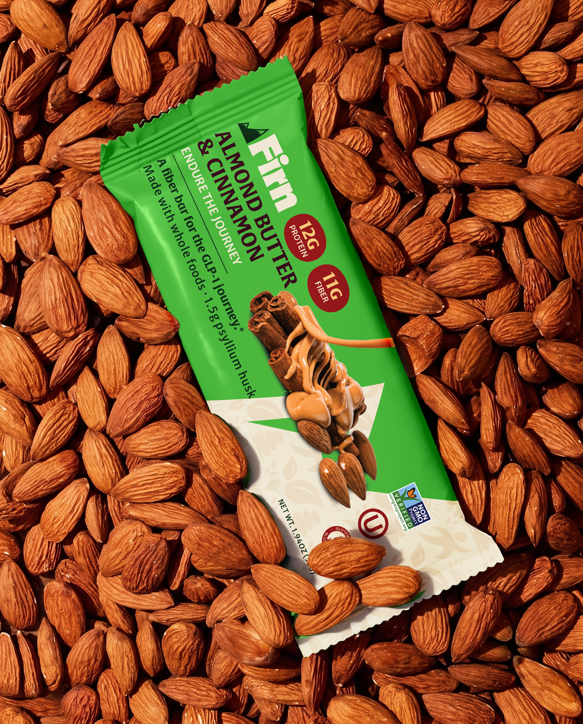
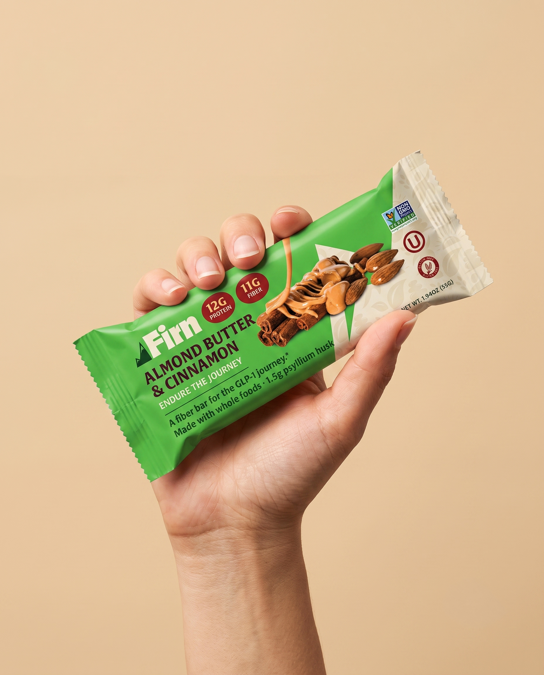
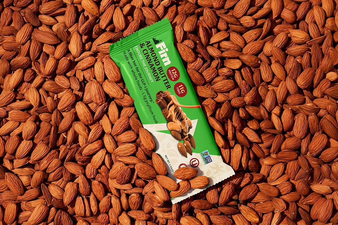
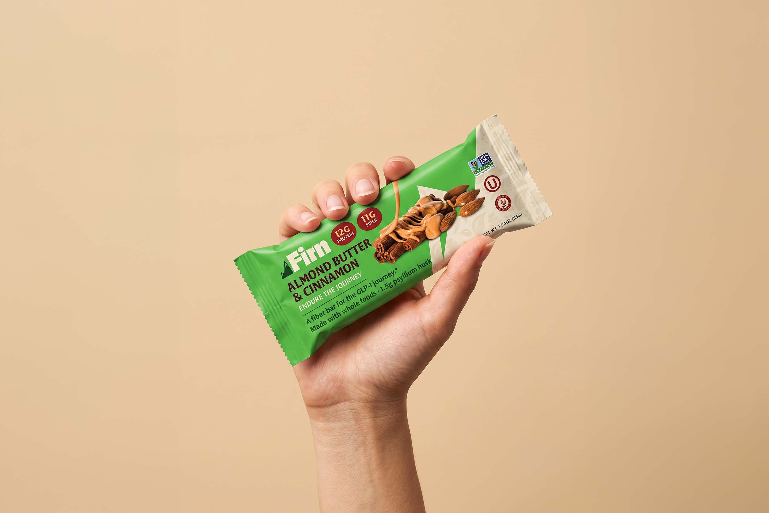
Four wrapper directions, all shown in almond butter and cinnamon. I told Melvin up front to ignore the colors, since those were swappable, and react to the layout and the hierarchy of information instead. He picked the third and asked for a bigger logo, a smaller flavor line, and warmer color options.
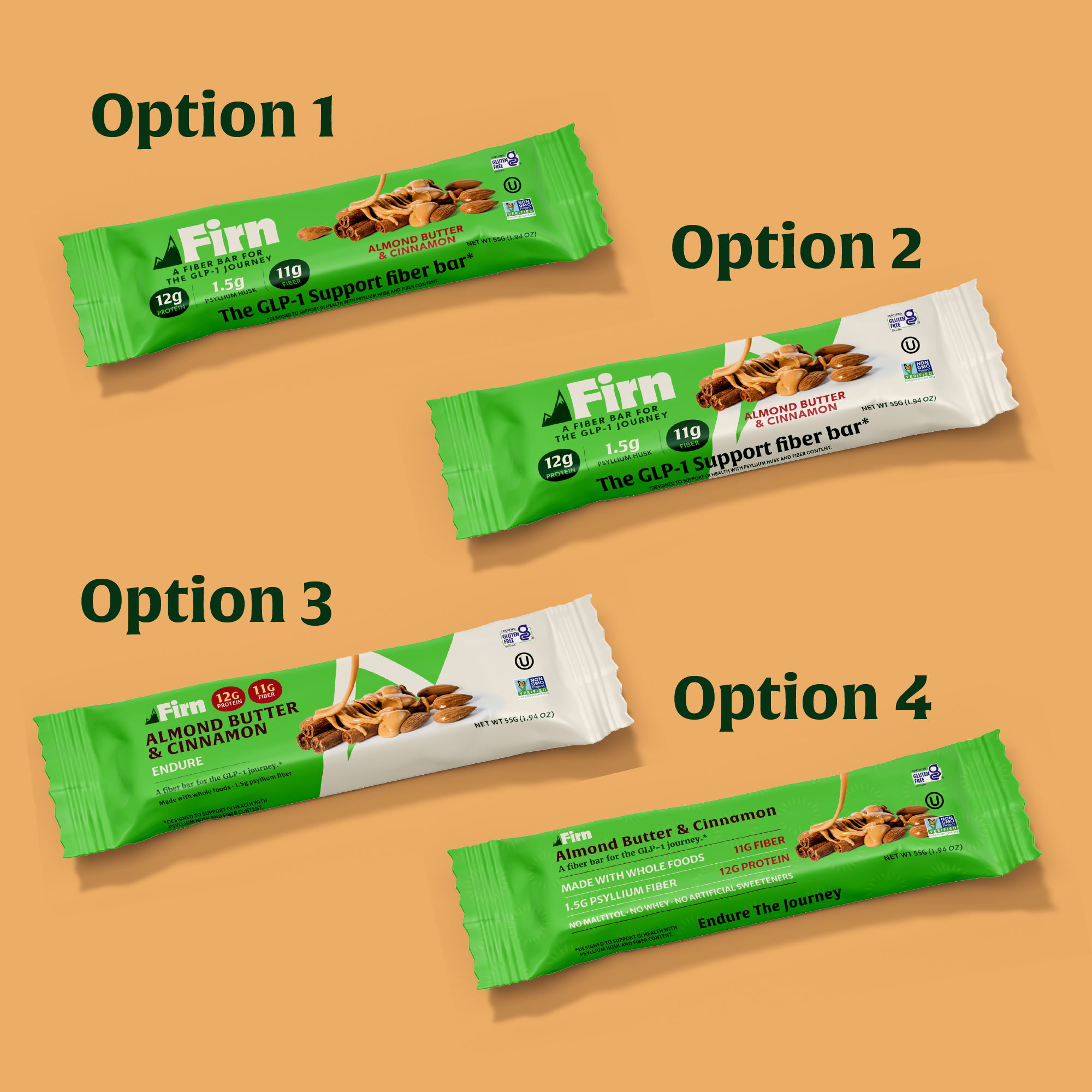
Then we tested it against the light. The darker grounds didn't have enough contrast against the cinnamon and almond butter photography, so tan won. The GLP-1 line got bolder, because the research said it was the fastest-reading thing on the package.
Most of this phase was regulatory, not aesthetic. Melvin's food attorney set the constraints and they shaped the design more than any reference brand did:
- The bar has to be called a fiber bar or snack bar in small print. That's the FDA standard of identity, and it can sit quietly.
- "GLP-1 companion bar" is permitted, with an asterisk and attorney-reviewed footnote.
- The footnote can't live at the bottom of the pack. It has to sit adjacent to the claim, which meant the fiber and protein callouts had to be physically next to each other so one disclaimer could cover both.
- Net weight runs ounces, then pounds, then grams, bottom right. Non-negotiable placement.
- The ingredient list stays in its mandated order, bottom of pack.
- No symptom claims anywhere. Not "helps with constipation." "Supports healthy function."
That last one is the whole discipline of this category. You can describe Sarah's experience as vividly as you want. You cannot say the bar treats it.
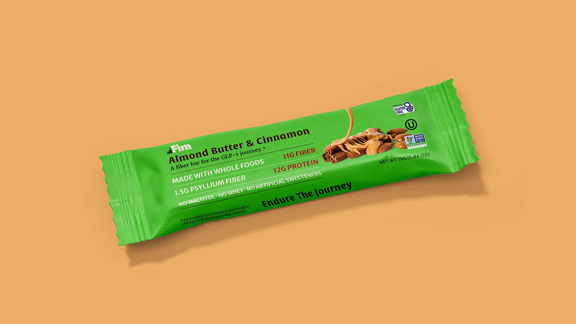
There was also an idea that didn't survive intact. I proposed a word on every wrapper, nine of them, with the customer picking three when she ordered her sample pack so the words landed in her hand thirty-plus times a month. Recognition, not affirmation. The brand seeing her rather than cheering for her. Melvin liked the concept and killed the mechanic, correctly: nine wrapper SKUs and packing one of each into a box is a manufacturing problem, not a design problem. Stripped back to a single word he went straight to ENDURE, because it tied to the name. So it shipped as one word on the wrapper instead of nine.
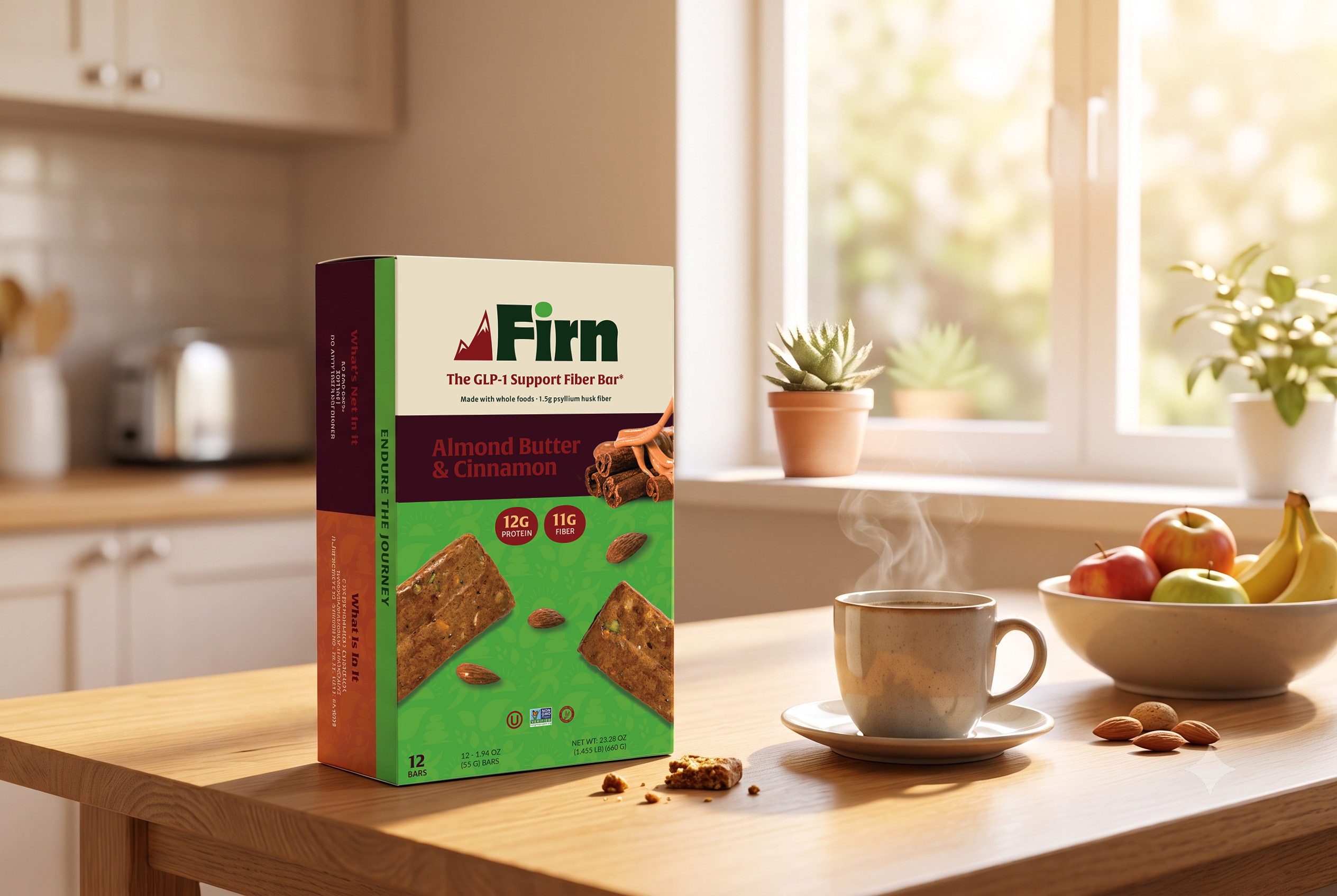
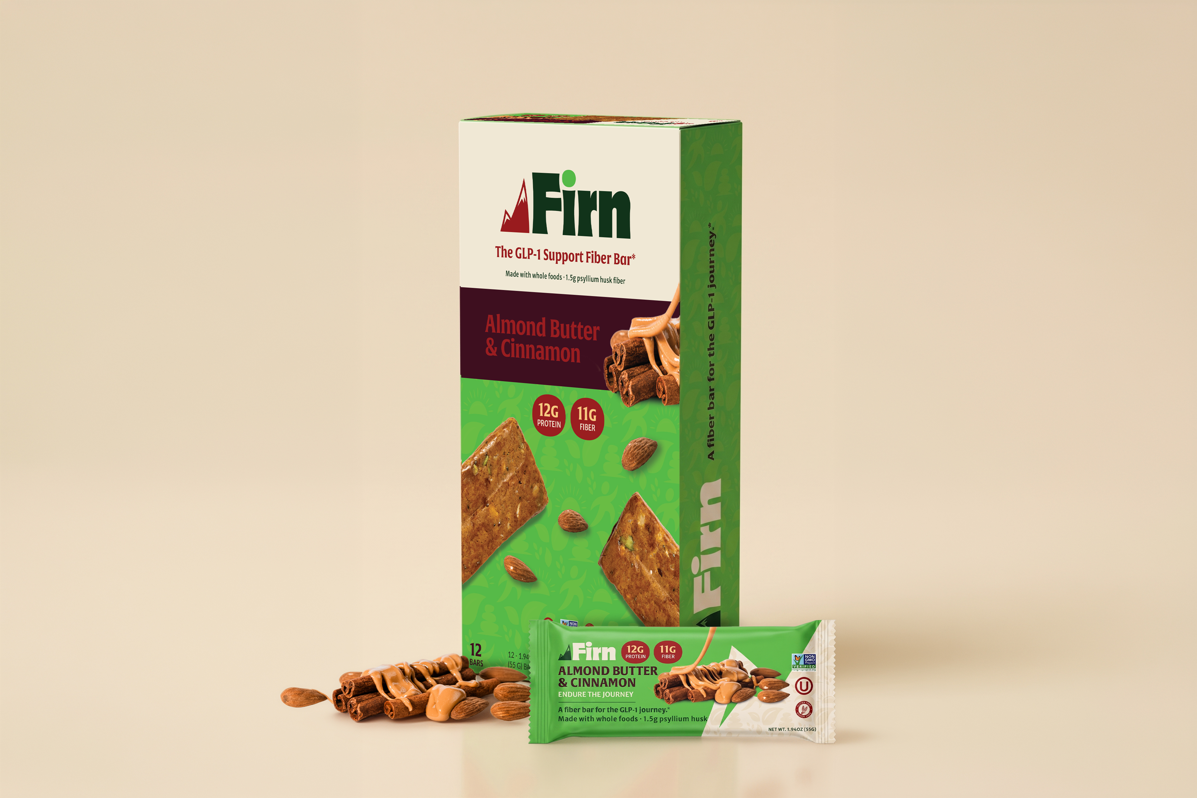
The box was designed to work as a point-of-sale display, with the top tearing away. I printed the wrapper and folded it by hand to check where the artwork landed on the seams.
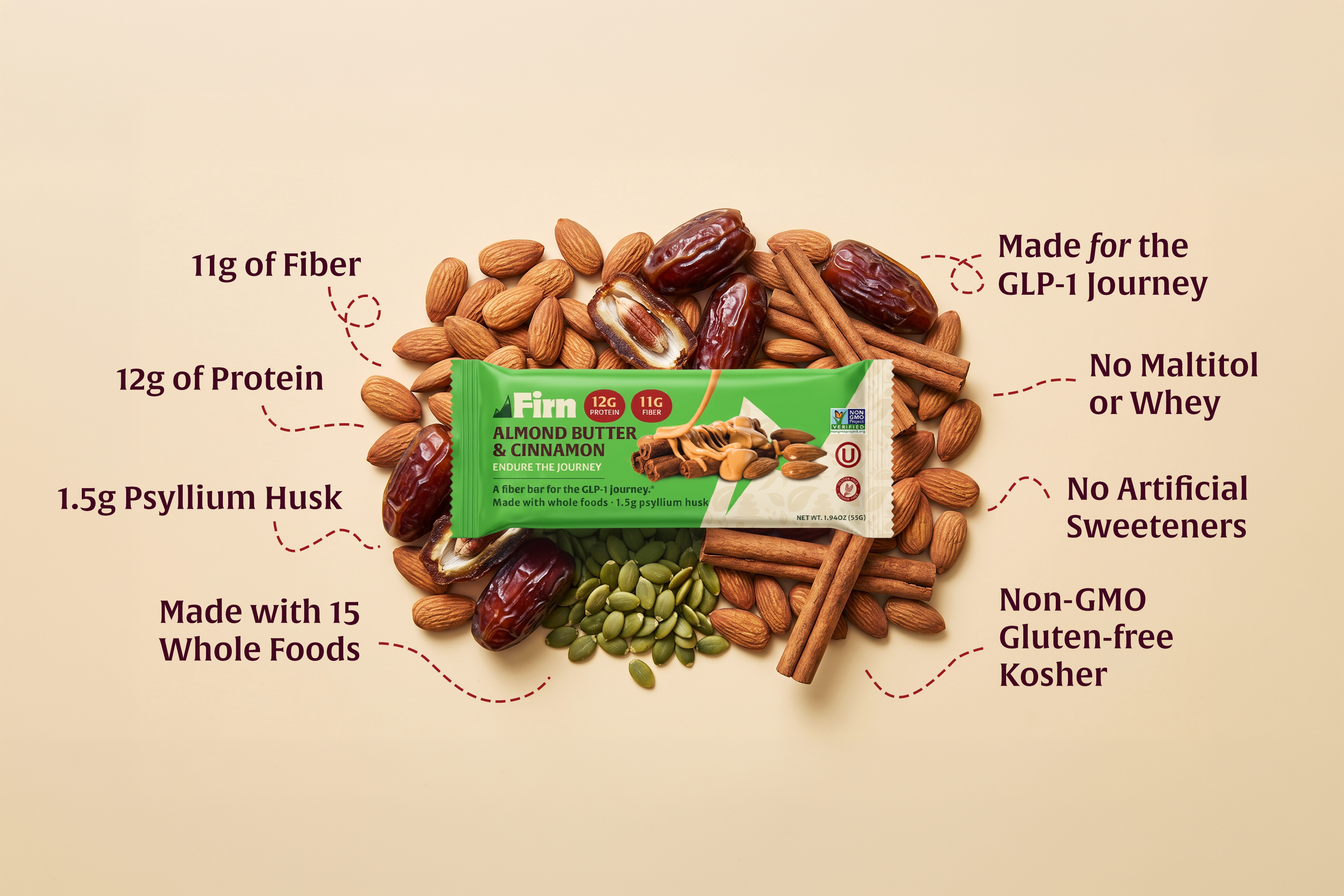
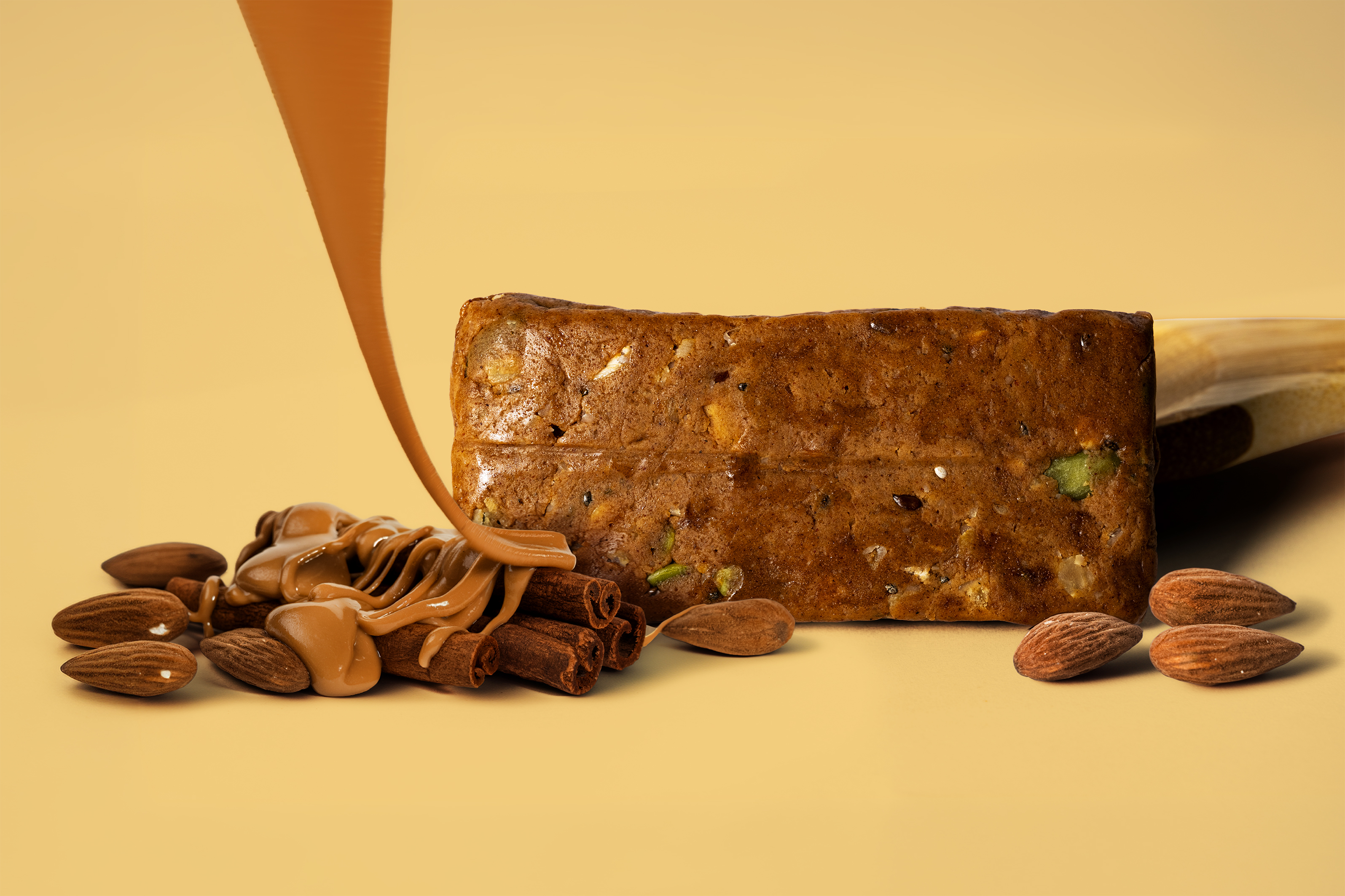
Nine pages, built as Shopify-ready comps. Homepage, product page, about, what's in it, FAQ, contact, wholesale, a GLP-1 guide landing page, and a policy template. Melvin was building the store himself; I delivered design, copy and structure.
Before designing anything I pulled apart David, RXBAR, Magic Spoon, Huel, Graza and Ka'Chava. The pattern is consistent. The winners lead with either the outcome or the product truth, carry a real founder story, stack trust relentlessly, and use more whitespace than feels comfortable. My earlier passes had paragraphs where those brands have a photo and six words.
The structural insight that reorganized everything: when a store sells one product, the homepage is the product page. It has to carry a narrative spine and a full conversion engine at the same time. That reframed the whole build.
The About page was the fight. My first several versions were type-led, loud headlines on flat color blocks with placeholder rectangles where photos should go, and they read like a template. That's the inverse of how premium food brands actually work. Vermont Creamery, Perfect Snacks and Nugget all lead with photography and keep the type quiet. Rebuilding it around full-bleed image beds fixed it, and each empty slot got a real shot spec written into the design so it doubled as the photography brief.
The client later asked to carry the product page pattern across to another brand of his. That's the endorsement I'd point to.
%20on%20ingredients%2016x9.jpg)
"You did great work. The site and everything was amazing. It looks very clean and very intuitive, and the colors and everything just very cohesive. A lot of the upfront work and research is making this easier. It's not work that was lost, because a lot of the research and the interviews are still going to be very useful, along with some of the design elements we're actually going to use and incorporate."
The bar isn't launching as Firn.
As the packaging moved toward production, the regulatory picture around GLP-1 claims was still unsettled enough that carrying them on the front of a package became a real risk. Melvin made the call to shelve the brand rather than commit to a print run he might not be able to use. It was the right decision, and I'd have made it too, and it still stings to have a finished brand package that nobody gets to see on a shelf.
Here's the part I keep coming back to. Remember Lisa, who said she'd buy the bar because it says GLP-1 and then hide it from people who didn't know she was on the medication. That's essentially what happened. The product is moving forward under a different brand with the GLP-1 line playing a much quieter role, which opens it to a wider audience than the one we built Firn to reach. The research outlived the brand it was built for.
So this isn't the last of it. I'm still working with the same client to get this bar into people's hands, just wearing a different name. Firn may come back in a year or two once the guidance settles.
I'm proud of this work. All of it.
Book a discovery call and tell me about the business and who you serve.
I build the strategy, run the shoot, and deliver the full edit plus the cutdowns.
You walk away with work your sales team sends in every follow-up email.

A creative studio in Lancaster County, Pennsylvania. Brand films, photography, and design for family-owned manufacturers, outdoor structure companies, and trades businesses.
Narrative film work lives at Stump & Root Films.